by Lisa Marie Hart
color defined by architecture, landscape and life
Interiors can be cozy and cocoon-like, moody and mysterious or simply a calm pause for the spirit. Whether grounded in a neutral foundation or layered with expressive color, the most successful spaces begin with a thoughtful response to architecture, landscape or the people who live within them. Three interior designers share how they shaped deeply personal design palettes for three distinct homes within the Las Campanas community.
contemporary contrasts
modern organic interiors balance high-contrast neutrals with natural materials to a cozy effect
photos by Jenna Peffley
ONE BLANK CANVAS led to another for designer Cara Scarola of WDB Interiors. After she and her husband built a home from the ground up, she considered the empty rooms another chance to begin with a fresh slate.
Set against the quiet openness of the golf community, the house was sited for peacefulness and views—conjured as a haven to nurture relaxation after a long workday. Outdoor living is integral to that sense of relief, and her material and color selections call out to the surroundings beyond. Her design also prioritizes the conveniences and joys of family life as well as functionality for easy entertaining.
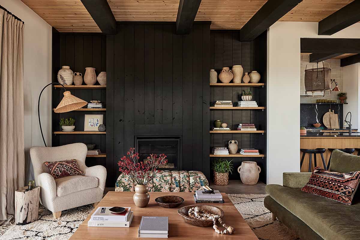
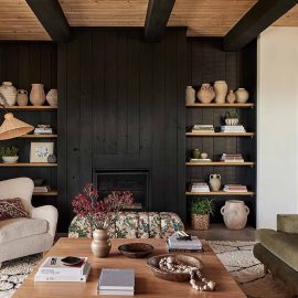
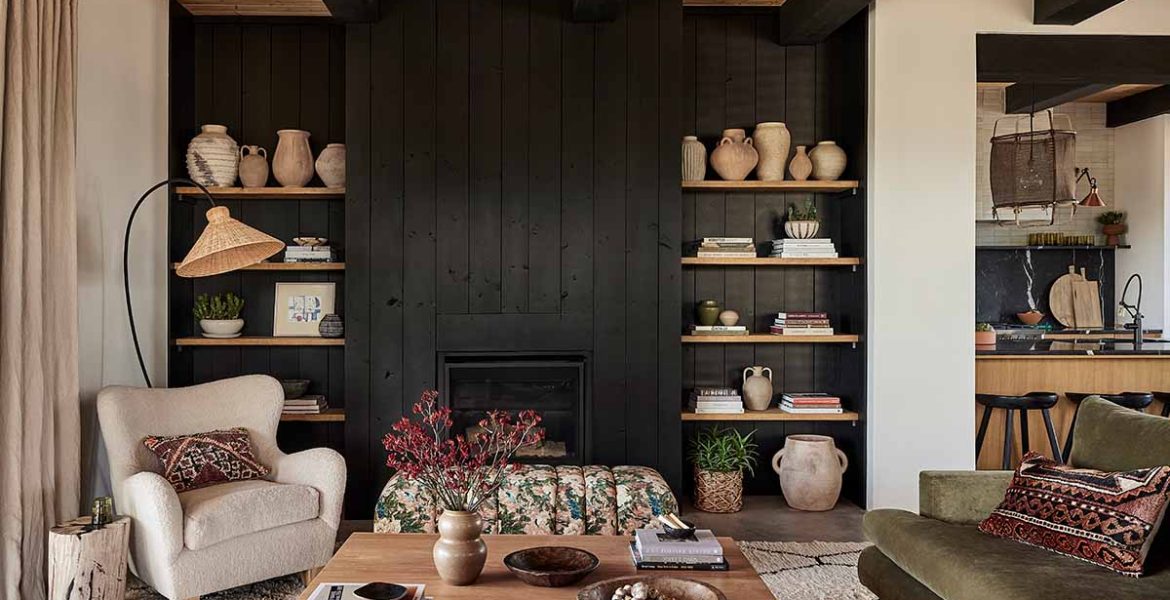
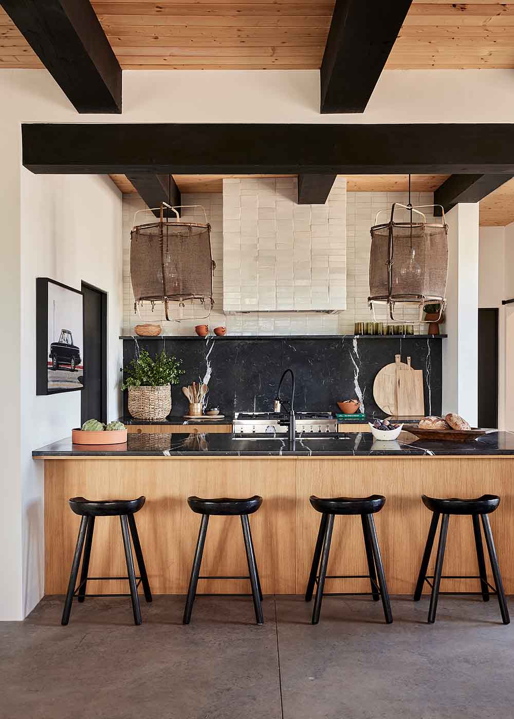
Scarola calls the aesthetic “modern organic.” It’s an inviting mix of muted colors, natural materials and meaningful collections that are both rooted in place and deeply personal—all punctuated with perfectly placed black elements for striking contrast. From custom furnishings to tile and lighting she’s long admired, each choice contributes to a home that looks chic and contemporary yet feels warm and welcoming.
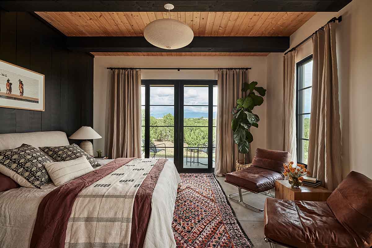
“The house is relatively clean and simple with its concrete floors, white walls, and black and wood accents,” she says. “It has a nice neutral palette, which gave us a lot of freedom.” Each space lay open to the possibility of personalization—a chance to make it a little different than the next, yet still part of a cohesive whole.
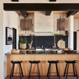
The heart of the home is the view-laden kitchen, living and dining area, set in an open-plan with glass sliders on multiple sides. It’s the place where they spend the most time, and the indoor-outdoor flow to the covered portals makes it live even larger. Two fabric-and-bamboo pendants from Thailand—saved on Scarola’s pinboard for years— hang above the sleek kitchen island with a black marble countertop with a waterfall edge. A single artwork depicting a black car heightens the drama of the contrasting styles.
Furnishing the house from scratch turned out to be a project highlight. “We decided everything goes—we’re starting over,” Scarola says. Her own custom pieces enhance the home’s style, scale and proportions. She juxtaposed them with vintage finds and work by local artists—a thoughtful mix she also brings to clients. Pottery and baskets gathered over time—some from the International Folk Art Market, others special gifts or passed down from family—create meaningful displays.
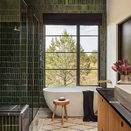
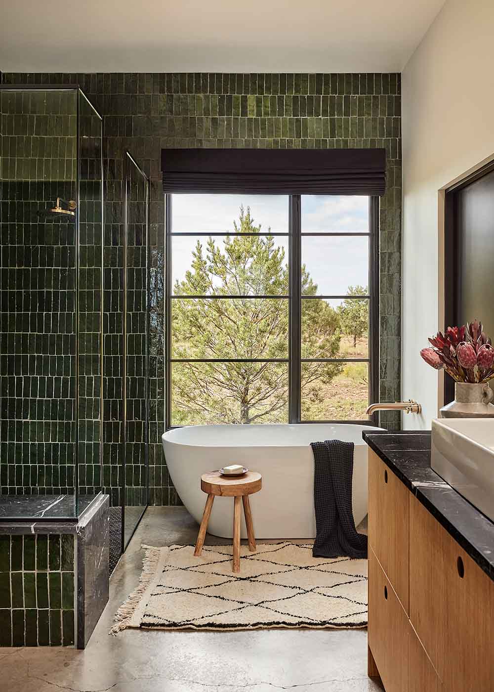
In the more private corners of the house, personality reigns. Her teenage son’s room features an eye-catching wood-trimmed wall treatment in matte green, while her daughter’s youthful lair embraces her love of collage, floor to ceiling, anchored by a custom headboard with black-and-white checked fabric. The color-drenched bathrooms lean into earthy hues Scarola notices deep in the landscape. “They’re an updated earthy,” she clarifies, “not the old fiery reds” traditionally associated with the region. Deep burgundy built-ins in one, and in the others, gleaming Moroccan zellige tile in ochre and botanical green—her favorite way to pump up the texture while reflecting natural light.
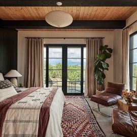
But it’s black that wraps every element together. Scarola introduced it with a measured hand—framing the windows and doors, bringing modernity to the mudroom, coating the vigas, plus one wall of the primary bedroom. The contrast gives the rooms a crisp edge without cooling them down, a contemporary twist on Santa Fe’s vernacular that still feels easy to live with. “Even though the house has these tall ceilings and a lot of glass, it feels cozy,” she says. The ideal place to relax.
Home Design/Interior Design: Cara Scarola of WDB Interiors (formerly Built Design)
hint of blue
a luxe modern home takes color cues from the closet
photos by 4Birds Photography
WHAT BEGAN AS A VACATION RETREAT for a Texas couple evolved into the luxuriously livable full-time home they’d long envisioned. He golfs; she’s into fitness. They both agreed that relocating to Santa Fe was their best move. Designer Chandler Prewitt of Chandler Prewitt Design shaped the complete remodel with an eye toward calm, modern environments that support their active lifestyle.
Originally featured on the Parade of Homes, the 15-year-old house had started to lose its luster. The couple was excited to invigorate their spaces with purposeful updates and upgraded finishes. Working with them remotely at first, Prewitt tailored the home to their personal taste and restored its sense of newness. “They wanted it to feel like Santa Fe, but with a bit more of a modern aesthetic,” he says. “She especially wanted something lighter and much softer to the eye.”
Quality materials and craftsmanship guided every decision. Prewitt’s approach centers on quiet luxury, longevity and a sense of place— values reflected in the home’s restrained palette and carefully considered details. A single question he posed uncovered their color preferences for the contemporary redo. “I like to ask clients, ‘If we were to go through your closet, what would we find?’” Prewitt says. “She has a lot of neutrals, but she also has a lot of blues.”
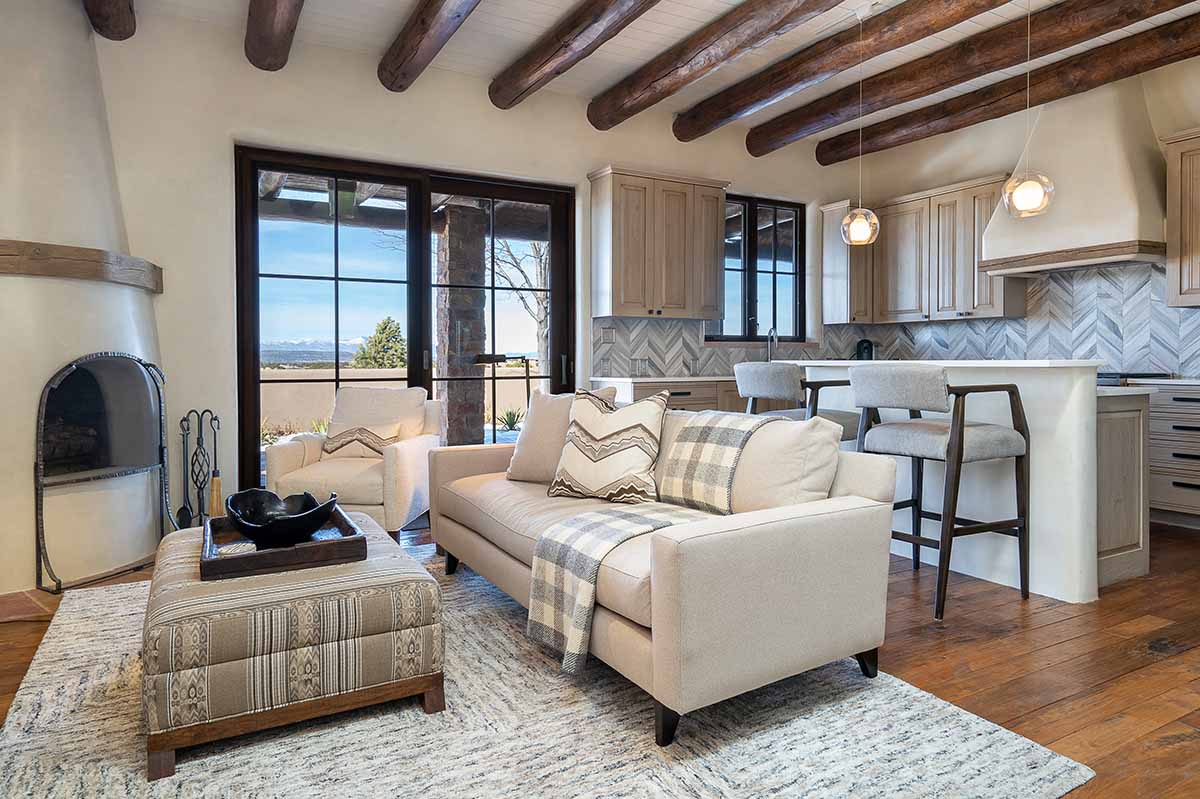
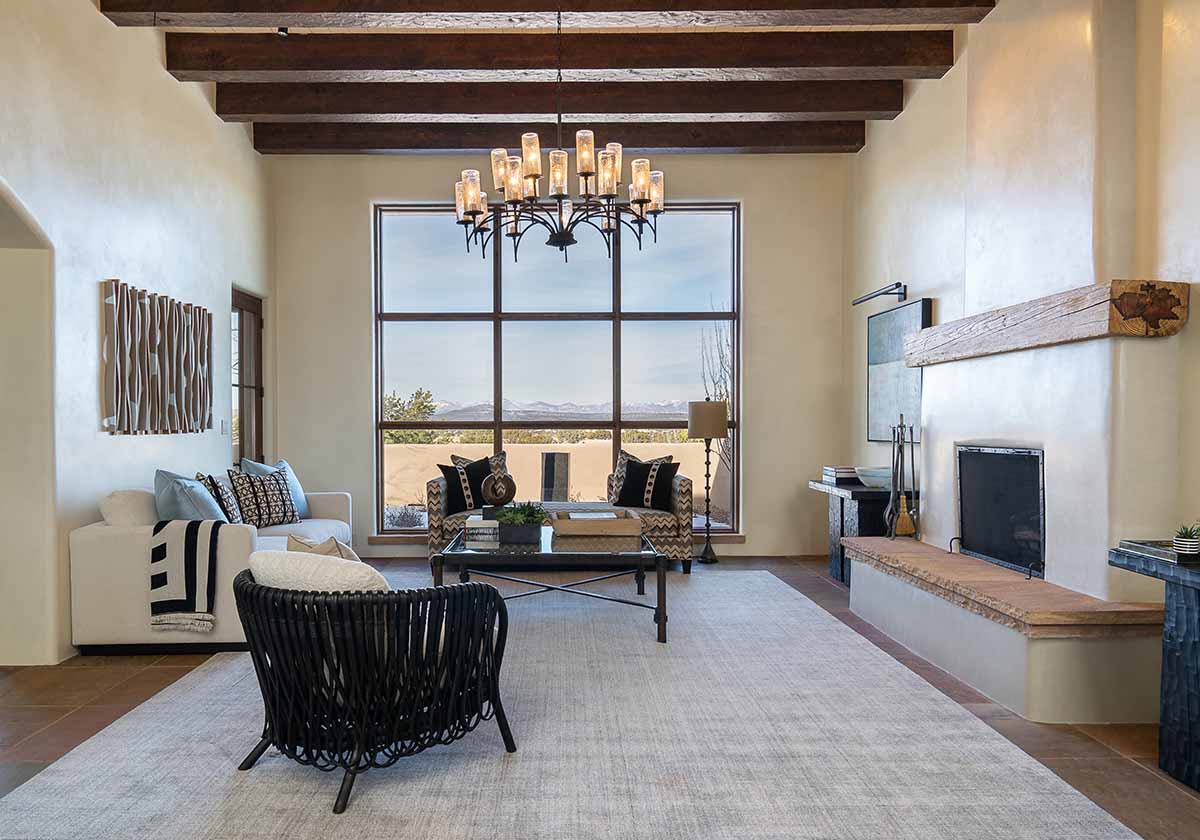
The remodel began with the broadest brushstrokes, including replacing the original, pink-toned plaster with a warm, creamy hue, extending wood flooring into the bedrooms and kitchen, and refining the existing cabinetry with a new paint treatment, glaze and hardware. “Coming up with the right color for the kitchen cabinets was really important to me—and something I labored over,” Prewitt says. Even as he wrapped natural wood bands around the kitchen hood, a kiva fireplace and the living room mantle, he ensured the wood tones complemented the palette.
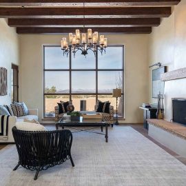
In the living room, Prewitt finessed the voluminous proportions to create a more intimate setting without losing its openness. A substantial water feature outside the window became part of the experience. High above, he removed the plastic, candle-style covers on the chandelier, then commissioned artisan hurricanes made of crackled glass—a bespoke enhancement that elevated the entire fixture.
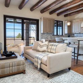
The kitchen and its adjacent lounge invite casual connection. Over the island’s bar-height chairs, bubble-shaped blownglass pendants balance the angles of the chevron tile backsplash. Steps away, a cozy fireside conversation area serves as the couple’s media room. Upholstering the ottoman in a Southwest fabric added a touch of regional flavor.
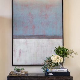
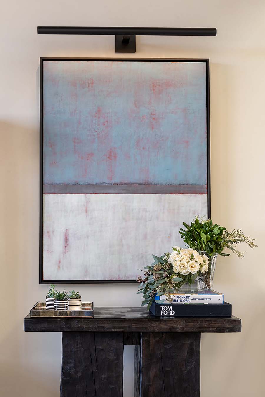
Art brings individuality and local color throughout the home. Prewitt curated significant works by Santa Fe artists, including two encaustic color-field paintings by Amy Van Winkle. “Our use of color was limited,” Prewitt notes, “so we let the artwork take center stage.” The dark wood console tables beneath each painting were handmade in New Mexico by Pfeifer Studio.
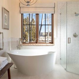
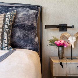
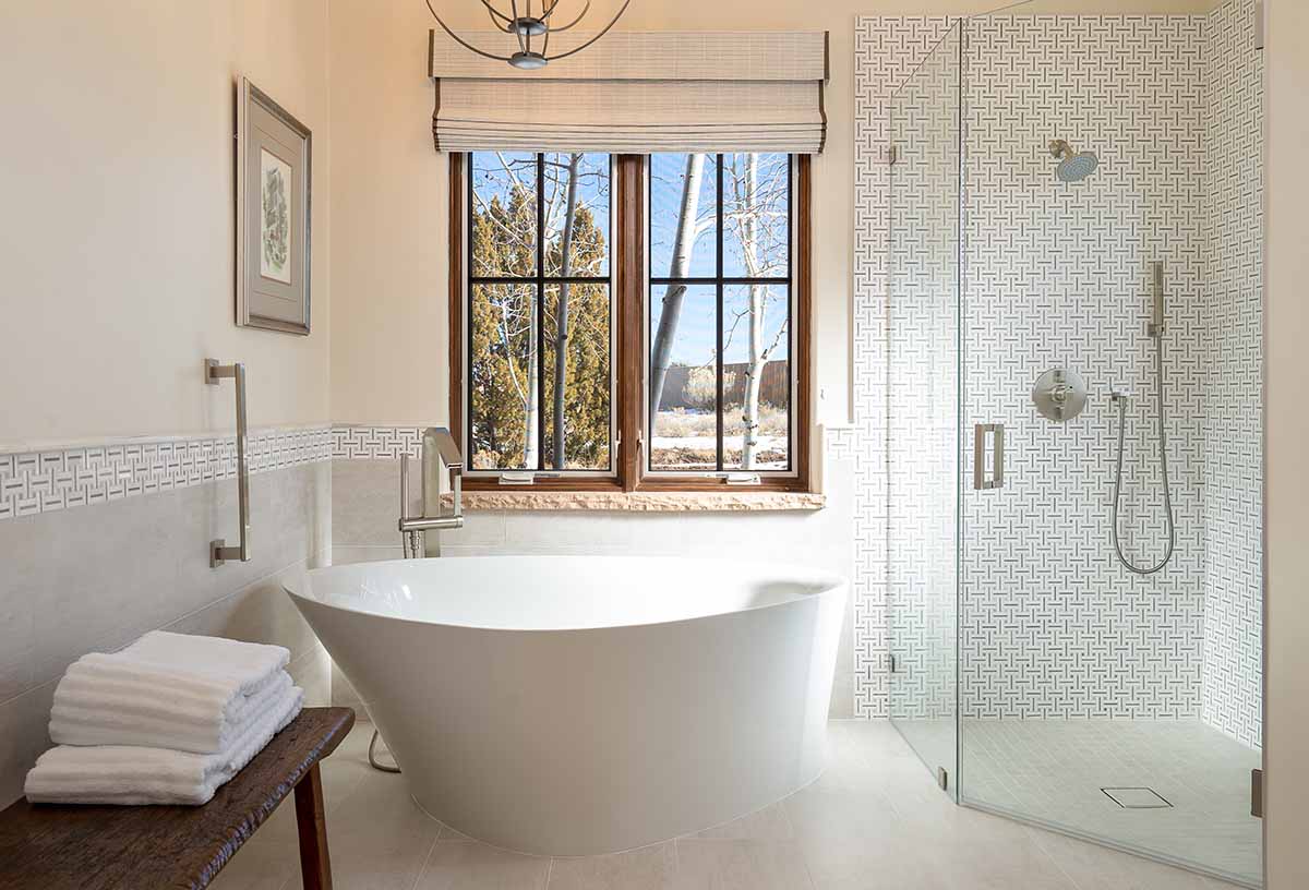
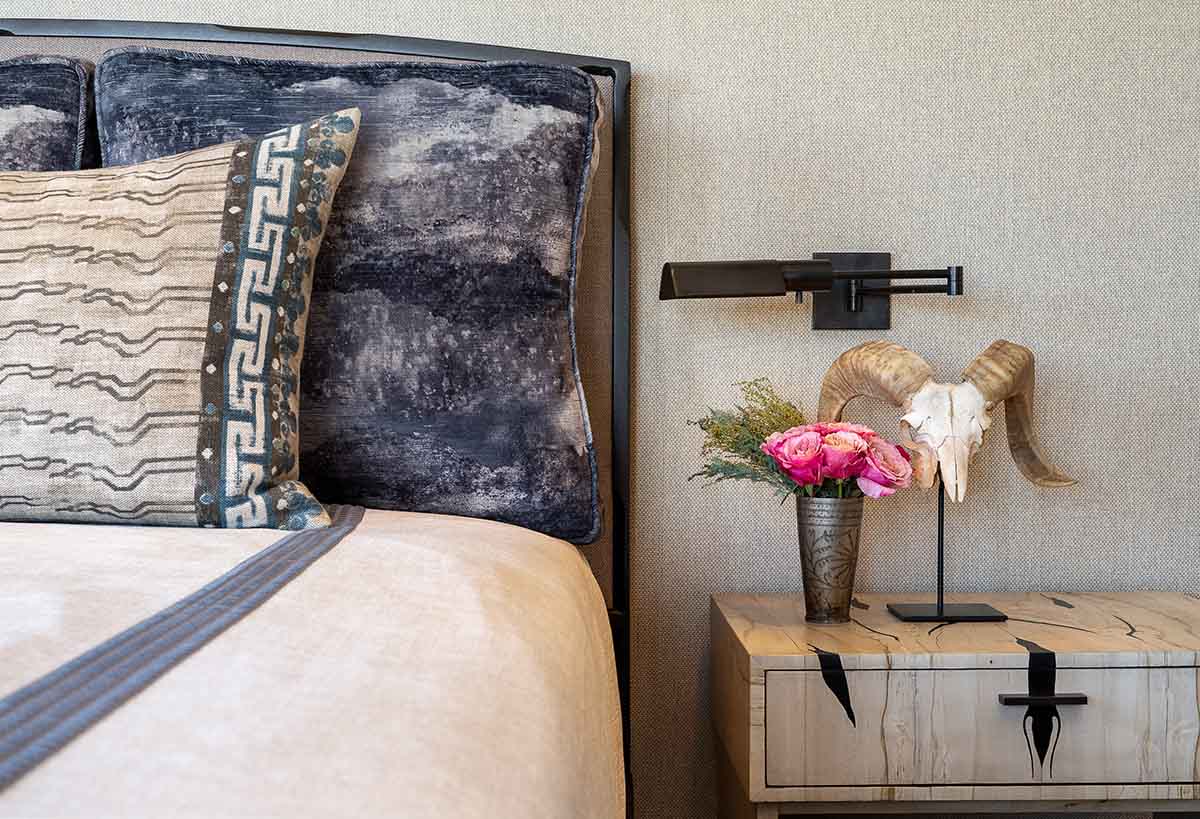
In the primary suite, floating wood nightstands and luxurious textiles with hints of midnight blue fold into a dreamy sanctuary. The lighter, brighter bathroom shines as one of the most dramatic transformations. Replacing dated finishes and the heavy look of the former built-in tub are an asymmetrical soaking tub, a minimalist chandelier and an antique bench. Summing up that space, and the full project, Prewitt says, “They really loved the way it turned out—and I love the way it turned out, too.”
Interior Design: Chandler Prewitt Design, chandlerprewitt.com
a desert rainbow
blending past, present and the colors of the high desert turns a new house into a soulful family retreat
photos by Amanda Powell
HOUSTON-BASED DESIGNER Mary Patton of Mary Patton Design knows exactly how to make a house a home—one that feels familiar, loved and just lived in enough, even from the first night under its roof. It’s a rare skill clients seek her out for, in addition to her joyful approach to elegant, eclectic interiors. For her family’s own Santa Fe getaway, she reached deep into her designer’s toolbox and applied her own best practices.
The couple chose a new Spanish Pueblo Revival home as they each have fond childhood ties to the location—her family had a second home in Santa Fe, while her husband spent summers there visiting his grandparents. A hideaway with sunset views promised a new chapter of memories plus more space for hosting guests than their Texas abode can offer. While its newness offered high ceilings, plenty of light and a feeling of openness that Patton loves, its blank spaces came up short on character.
“Time is valuable, so I didn’t need to commit a year to a renovation or invest in construction,” she says. By using her signature techniques for layering furniture, draperies, rugs and local finds, “I worked with what was already here to make it our own.”
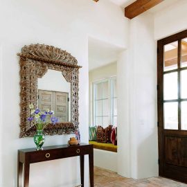
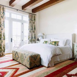
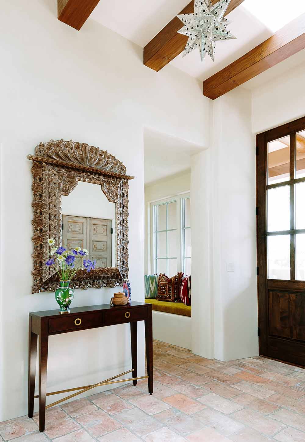
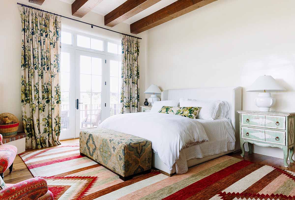
Patton’s approach blends past and present with an easy confidence—a mix of new custom pieces, plus vintage finds and antiques that infuse instant warmth. She gravitates toward furnishings with history and soul, pairing traditional motifs with unexpected touches. Here, Moroccan kilims, French nightstands and an antique Spanish mirror live in richly textured harmony.
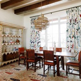
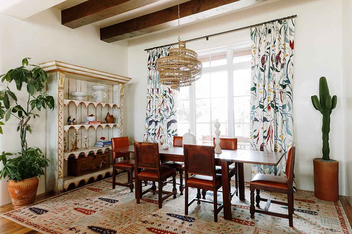
A devotee of patterns and prints, she followed her textile obsessions. Fanciful fabrics she had treasured but never used found their way into her design. Pierre Frey drapery in several rooms underscores her belief that well-chosen florals can soften and elevate Southwest style.
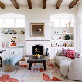
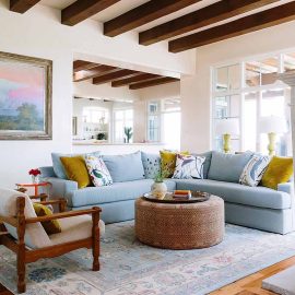
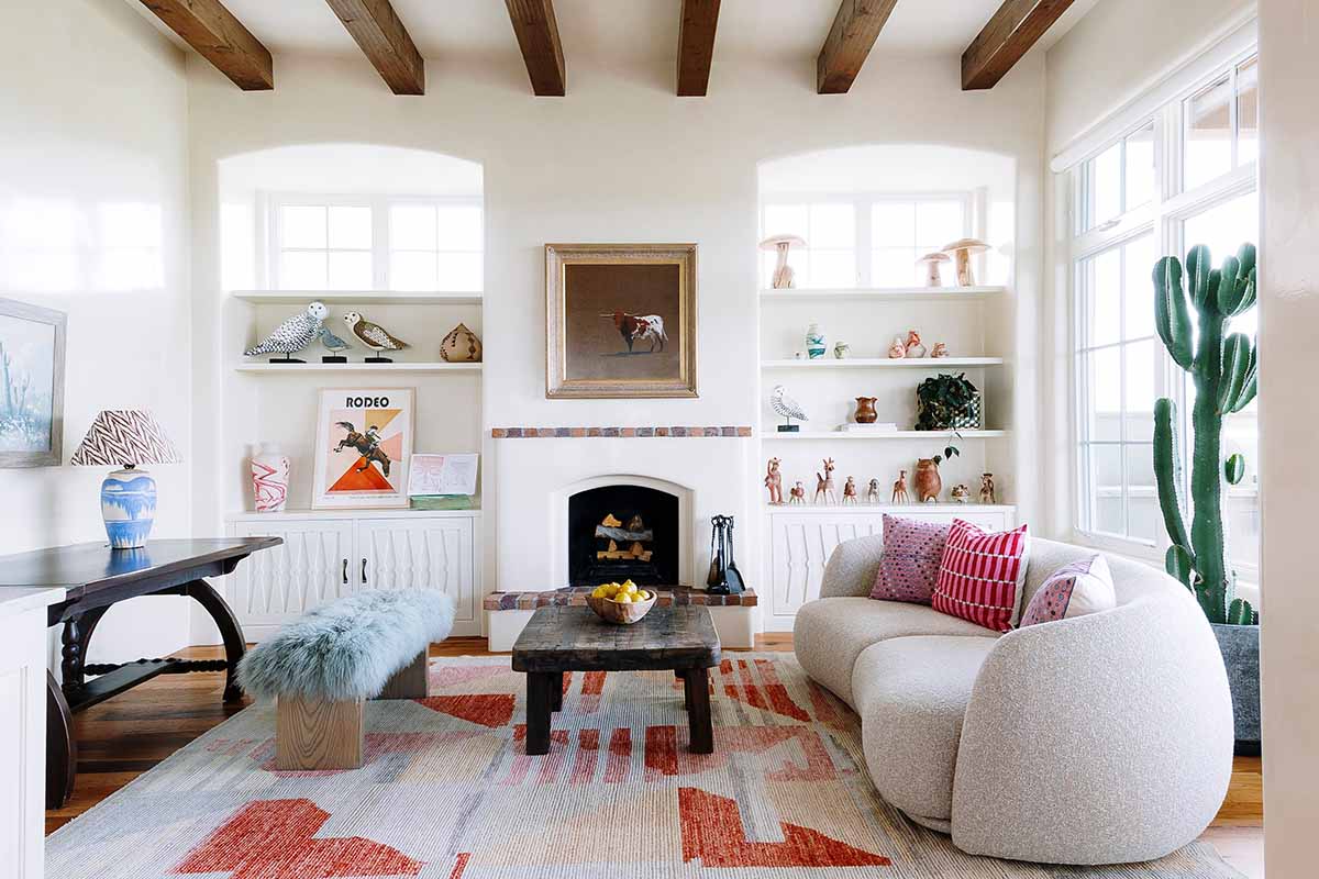
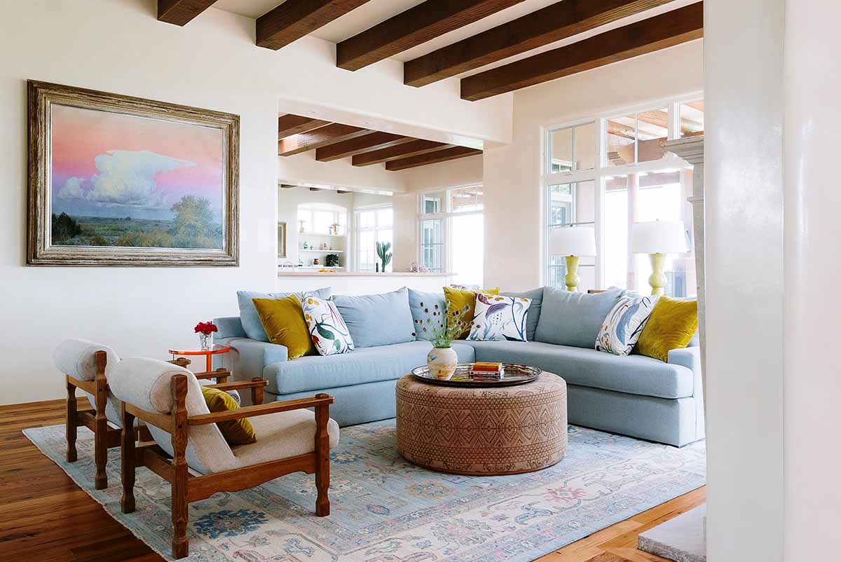
The home highlights Patton’s artfully placed color, as if by a paintbrush, in a palette that celebrates the vibrancy of the high desert. “This setting is so beautiful. If you pay attention, you can pick out every single color of the rainbow,” she says. Her creative execution harnesses the sky in the custom pale blue sofa and a sunset pink rug in front of the tub. She reflects the rock in earthy tones of leather furnishings, while colors from the plant life and wildflowers grace accents sprouting throughout the home.
Patton didn’t bring existing artwork or accessories, yet she wanted each room to feel inviting and collected. She has a surprising trick for shopping swiftly to achieve a curated look: consignment stores. “I’ve found several in town that have the coolest stuff,” she says. Often, she strikes gold and discovers pieces all from one home that already work together—a readymade assemblage for her living room built-ins or the dining room’s antique Spanish shelving.
Knowing that plants enliven any home, Patton asked the owner of SABO in Santa Fe to outfit hers with a selection of living decor. Even easy-care cacti, she notes, add another layer of visual softness and interest.
Her finishing flourish illuminates the entry with a touch of sentimentality. “Growing up, my family had a light just like this one,” she says of the star-shaped tin pendant lamp, studded with rainbow-colored glass. “I always remembered it.” Simple and rustic, her favorite light fixture brings a long-held affection into the family’s new home right from the threshold.
Interior Design: Mary Patton Design